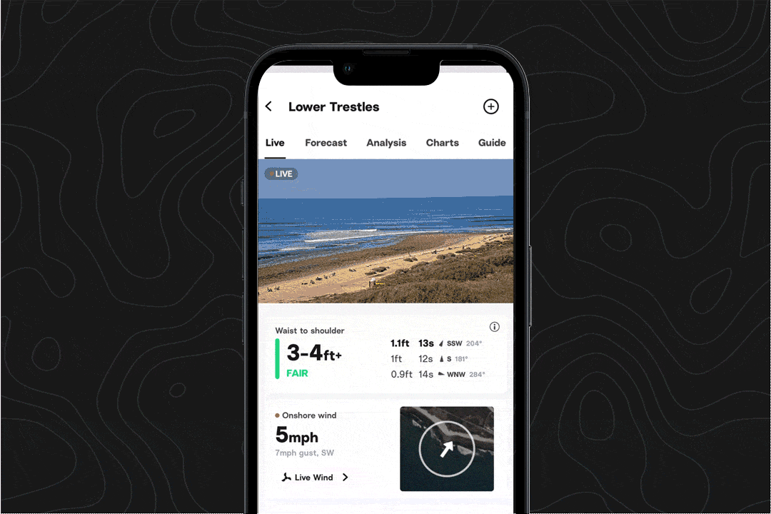
Wind and swell data at a glance
We've brought the swell rose back to the spot page, so you can see how wind and swell will work together (or against each other) at your spot, in one clear view.
While a variety of factors determine the quality of surf conditions, understanding how swell energy and wind are showing up at your break gives you a leg up on knowing how surf conditions will feel.
Where to find the swell rose
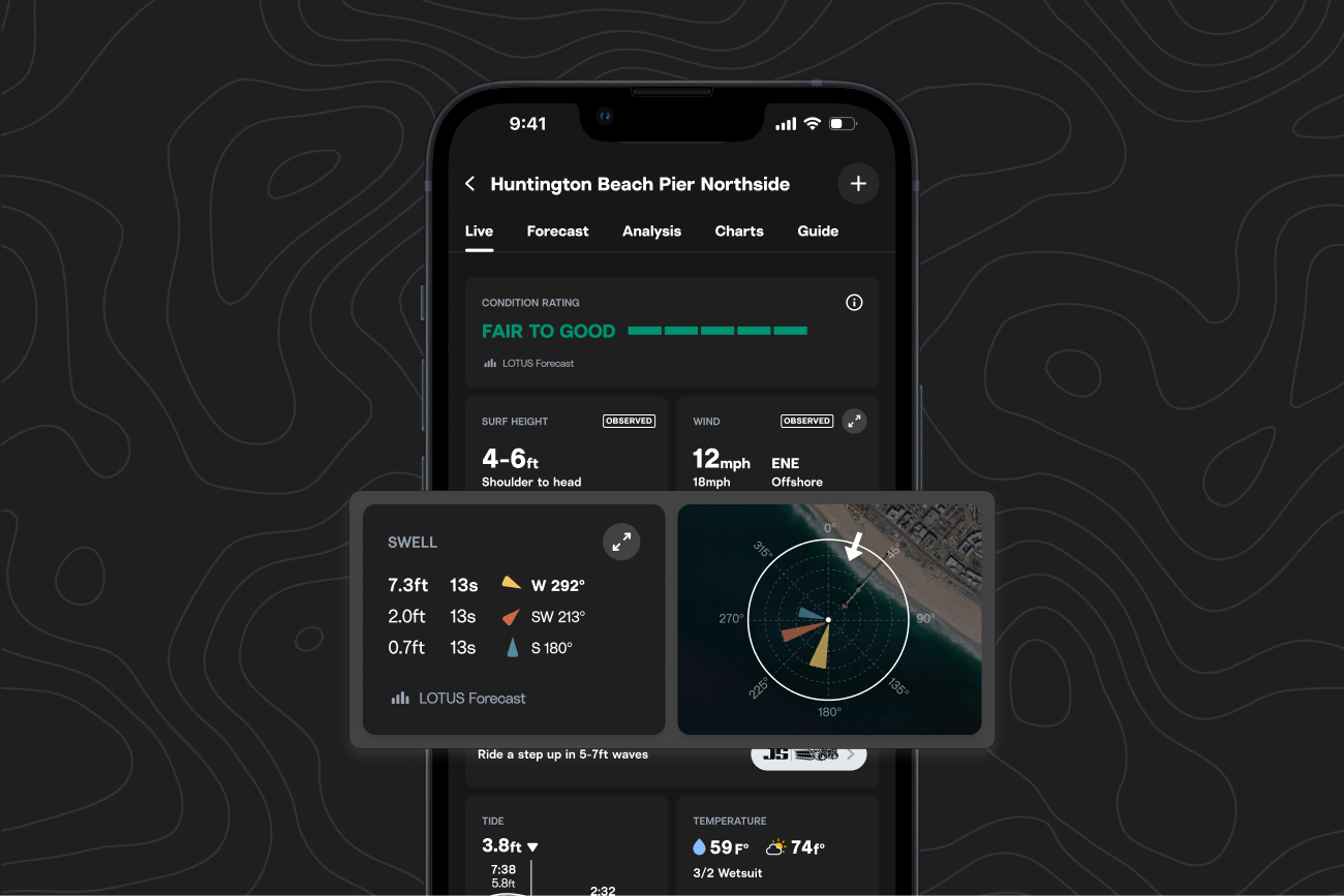
Open any spot page, and you’ll see the swell rose next to the swell directions card. It’s a circular graphic that plots swell direction, size, and wind arrows together.
Currently available on iOS and Android.
How to use the swell rose
Petals and Arrows
The white arrow shows wind direction, and the colored ‘petals’ show where swell energy is coming from.
Longer petals mean more energy, and wider petals mean energy is more spread out.
- Narrower spread: more organized sets with consistent shape.
- Wider spread: peakier, more variety, shorter waits between sets.
When swell energy is pointed more directly at the break, expect bigger, stronger waves. When wind is directed away from the break (offshore winds), expect cleaner conditions. That said, different breaks receive swell energy differently.
We recommend logging your sessions to see what swell energy patterns result in the conditions you like to surf.
What do we mean by directional spread of swell energy?
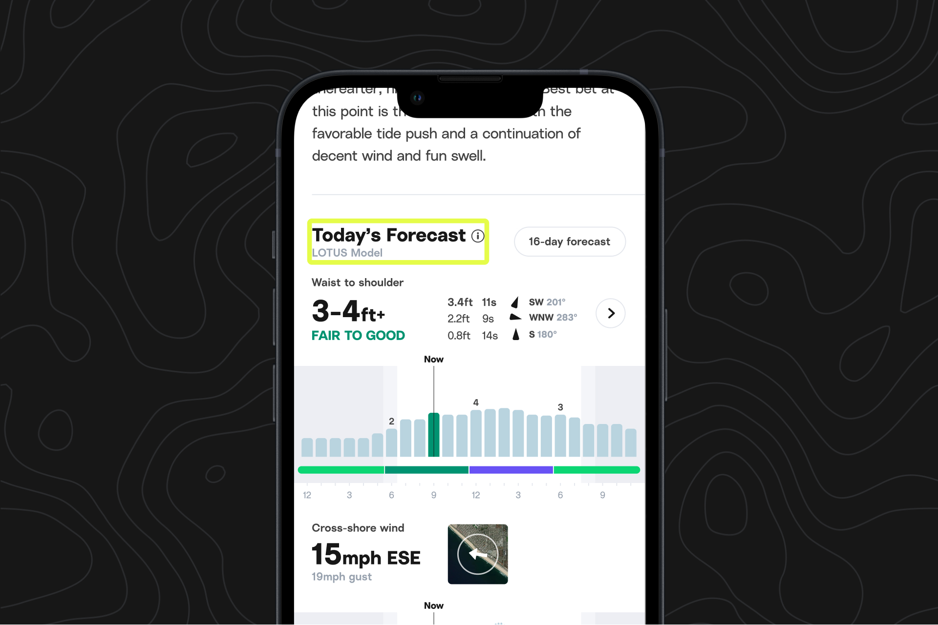
Swell graphs usually show peak energy (e.g. 3ft at 13s, S @ 176), but not how spread out that energy is. We know from experience that two days (or even two hours) with that exact reading can still result in different surf conditions.
When directional spread is narrower, more of the waves are coming from that indicated direction, which tends to result in more waves in a set, and for waves to be more organized and uniform in terms of shape and size.
When directional spread is wider, shorter-period and longer-period waves will be in the mix, leading to conditions that will be more mixed-up and disorganized.
If you're looking for a more granular look at swell energy distribution, check out the swell spectra graph by expanding the swell card and hitting "Swell Spectra".
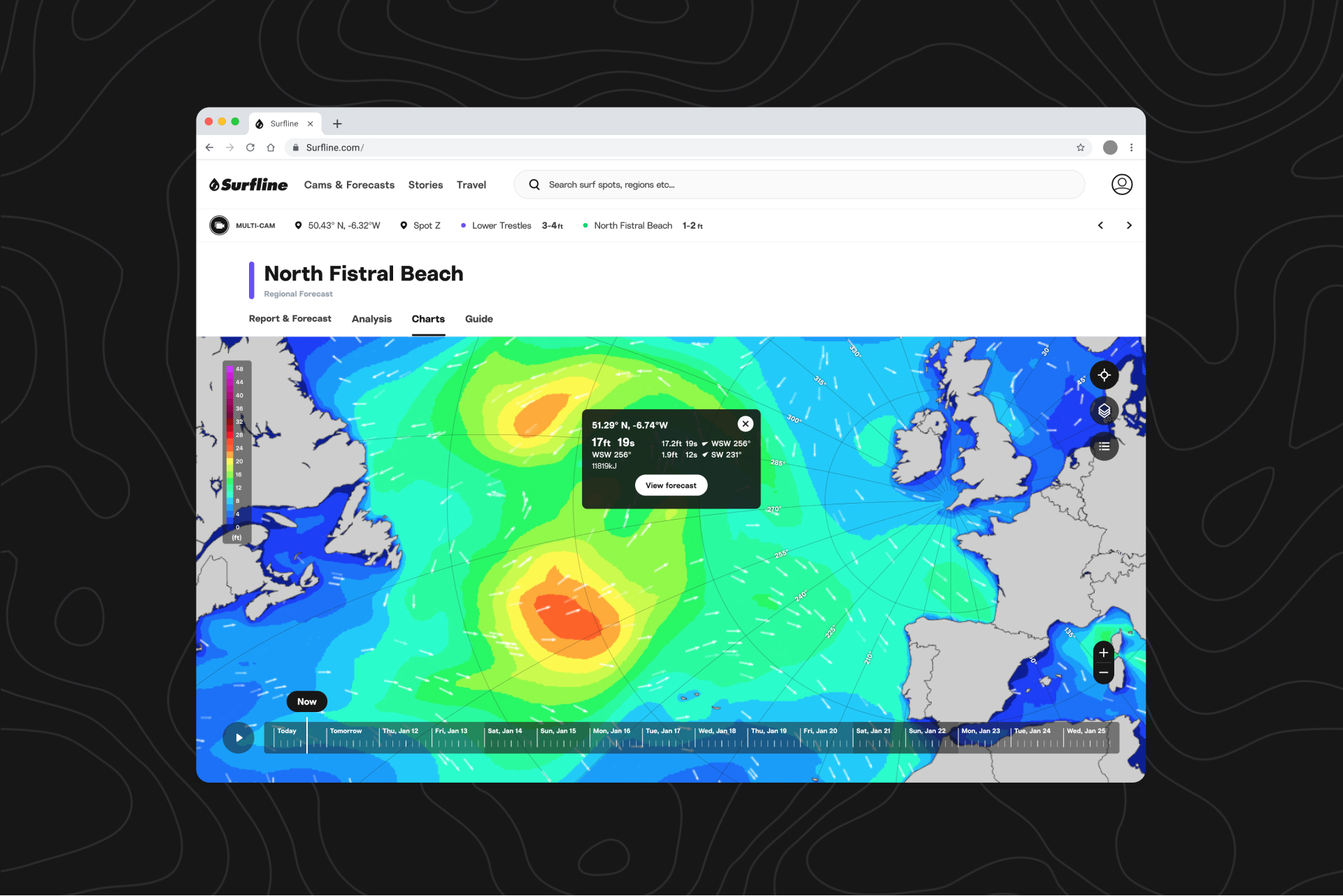
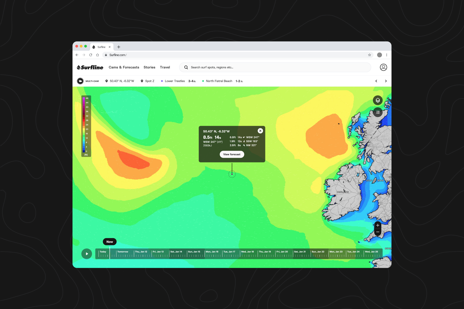
Get a clearer read on how the swell reaches Southern California.

For a limited time, this high-res layer is available to all users. To get started, open charts and zoom in to the Southern California region.
We’ve added a new high-resolution nearshore model to charts that shows coastal swell detail that lower-resolution global models can’t. When you zoom into the region in the Wave Height tab, you’ll see how swell wraps around coastal features with more detail.
The nearshore model uses detailed bathymetry and local wave physics from our LOTUS modeling suite to give you a more detailed view of what’s arriving along the coast.