
We’ve just shipped buoy swell spectra graphs, which show the distribution of swell energy over a given period and will help you understand what surf conditions to expect as a result. Some surfers, including those used to the MSW interface, consider this feature to be even more valuable than our cams—and you know how much we love our cams.
When and how you’ll use buoy swell spectra (and what it looks like).
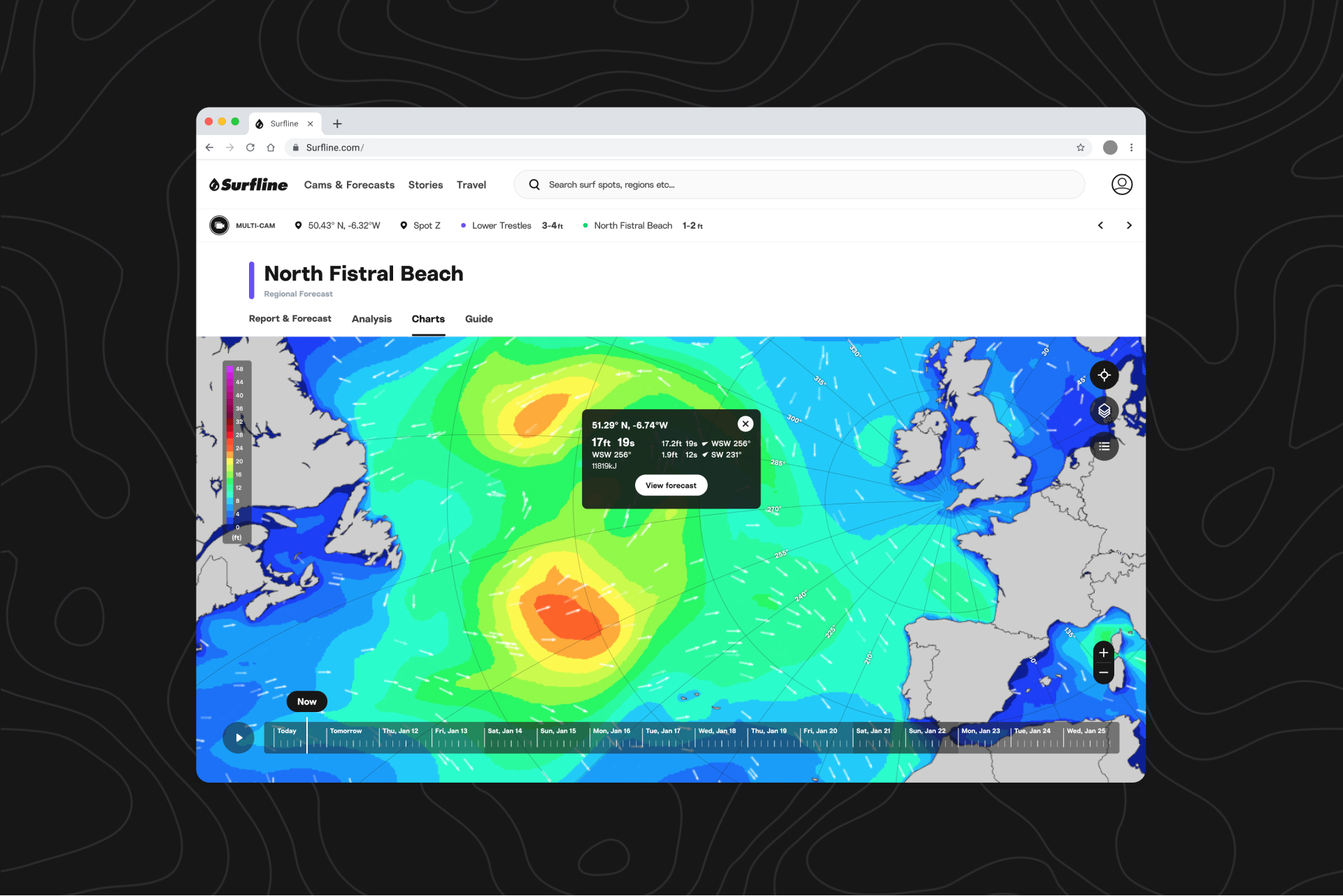
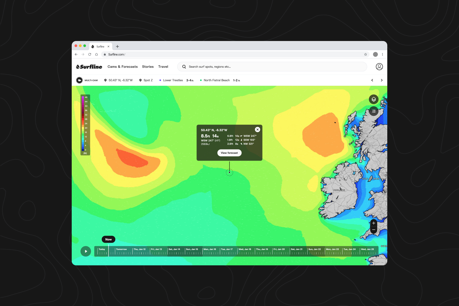
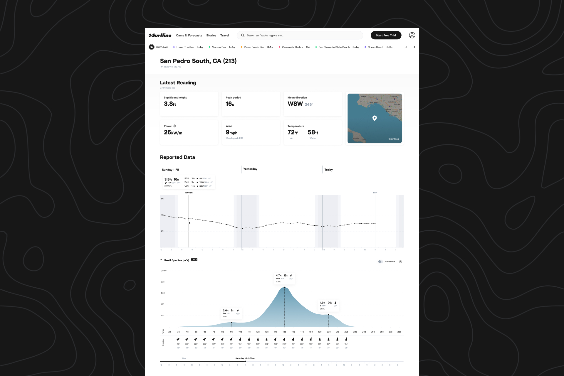
Let’s say you know that your local beach break likes combo swells, while your local point break prefers clean, long-period swells. You wake up before dawn and check the buoys, using buoy swell spectra to see that there are two distinct swells in the water—3 feet at 16 seconds from the southwest, and 4 feet at 10 seconds from the northwest—which spot are you going to surf? The beachie that likes combo swells, of course.
When looking at the buoy swell spectra graph, that combo swell would be shown with a wide distribution of energy across swell periods (a gradual, wider curve in the graph). Narrower, or more concentrated spectrum (shown as a spike or noticeable peak in the graph) means more organized and direct swell energy. You can learn more about different distributions in our blog about swell spectra.
Once you know what makes a spot hum, buoy swell spectra is a powerful tool that guides you toward good surf. So powerful, in fact, that our VP of Product and Innovation (as well as the founder of MSW), Ben Freeston, recently said the following in a meeting:
“If I had to choose between cams and buoy spectra to know what the waves are doing, I'd choose buoy spectra."
Where to find it.
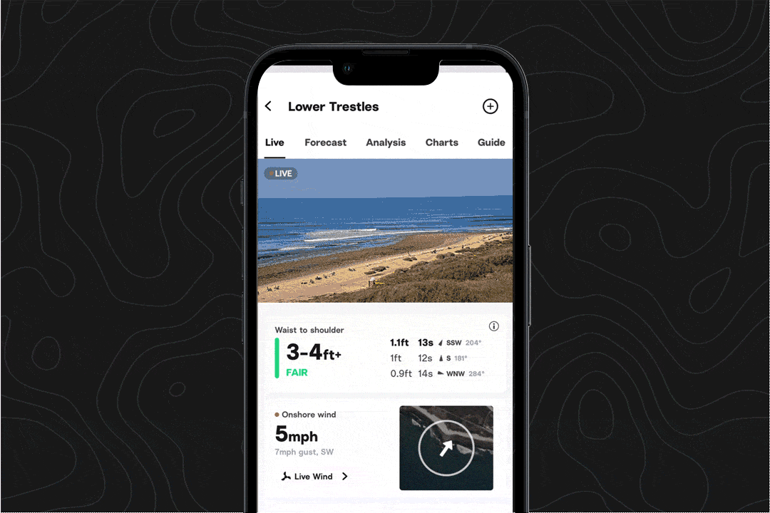
To try out buoy swell spectra on iOS, visit the explore tab, scroll down, and toggle to buoys.
You can also scroll to the bottom of a spot page and click on your local buoy (all platforms). You’ll find the spectra graph below the latest readings and reported data graph.
Observed vs. forecasted metrics.
If you’ve checked Surfline on the web, you may have seen our recently shipped feature, swell spectra graphs on spot forecast pages. Those graphs show forecasted conditions, while buoy swell spectra offers observed data, which is raw and nearly real-time data. Soon, you’ll be able to check forecast swell spectra graphs on iOS as well.
We get that these concepts aren’t as simple as the, “Wake up, check the report, check the cams, go,” routine that many surfers (including some of the team here) follow. But for some, buoys are a key part of surf planning—and buoy swell spectra will greatly enhance that experience.